| View unanswered posts | View active topics |
It is currently Thu May 14, 2020 9:20 pm |
|
All times are UTC - 5 hours |
| Page 6 of 9 |
[ 133 posts ] | Go to page Previous 1 ... 3, 4, 5, 6, 7, 8, 9 Next |
Ray fletcher's sprite exhibit:Challenger Approaching!
| Author | Message | ||||||||||||||||||||||||||||||||||||
|---|---|---|---|---|---|---|---|---|---|---|---|---|---|---|---|---|---|---|---|---|---|---|---|---|---|---|---|---|---|---|---|---|---|---|---|---|---|
|
Site Admin  Joined: Mon Aug 11, 2008 2:06 pm Posts: 2729 Location: Lost in memories Country: 
Skype: eriko.hemming |
Broken record, if you expect it, stop crying about it I intend to improve the sprites as I said, But I doubt they would satisfy your needs anyway _________________ Child ~ CardCaptor Sakura |
||||||||||||||||||||||||||||||||||||
| Tue Sep 08, 2009 6:49 pm |
|
||||||||||||||||||||||||||||||||||||
|
Joined: Wed Apr 29, 2009 11:28 pm Posts: 323 Location: Nowhere, Antarctica Gender: Anime Girl Skype: Evilagram |
I'll stop when things have changed for the better, which they have absolutely no sign of doing.
They'll satisfy my needs when they're good enough to satisfy my needs. And that particular point at which they will do so is when true effort is put into them. When there is a willingness to improve. I do not considering this copying to be an effort or willingness to improve. Editing even less so. _________________  Style [Stayl] (n) - One's unique and personal method of defacing a perfectly good piece of paper. READ THIS: http://ipgd.freehostia.com/copypasta.html |
||||||||||||||||||||||||||||||||||||
| Tue Sep 08, 2009 8:21 pm |
|
||||||||||||||||||||||||||||||||||||
|
Joined: Thu Aug 14, 2008 12:15 pm Posts: 555 Gender: Anime Girl Currently Playing: Sitting down and playing video games is for chumps. |
Overall, they look great.
At least, until they're animated... Then Evilagram has a point. Just, put in more transition frames. _________________ ~~~~~Ferail'09~~~~~ |
||||||||||||||||||||||||||||||||||||
| Tue Sep 08, 2009 8:25 pm |
|
||||||||||||||||||||||||||||||||||||
|
Site Admin  Joined: Mon Aug 11, 2008 2:06 pm Posts: 2729 Location: Lost in memories Country: 
Skype: eriko.hemming |
I think this is everything I have up to date so far,
http://i140.photobucket.com/albums/r14/ ... PEriko.png There are still missing parts like re-colors and Eriko's tail _________________ Child ~ CardCaptor Sakura |
||||||||||||||||||||||||||||||||||||
| Tue Nov 24, 2009 6:12 am |
|
||||||||||||||||||||||||||||||||||||
|
Joined: Mon Aug 11, 2008 9:13 pm Posts: 25 Location: Your ear Gender: Female |
Me likey _________________  |
||||||||||||||||||||||||||||||||||||
| Sat Nov 28, 2009 3:39 am |
|
||||||||||||||||||||||||||||||||||||
|
Site Admin  Joined: Mon Aug 11, 2008 2:06 pm Posts: 2729 Location: Lost in memories Country: 
Skype: eriko.hemming |
^.^ An Electric move I was working on  Plus the updated sheet http://i140.photobucket.com/albums/r14/ ... ogress.png Random stuff over a day or two I made but didn't care to post or finish making 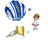 Anyways does anyone have any good ideas for Thunder attacks I could try ? _________________ Child ~ CardCaptor Sakura |
||||||||||||||||||||||||||||||||||||
| Thu Dec 24, 2009 10:33 am |
|
||||||||||||||||||||||||||||||||||||
|
Site Moderator  Joined: Mon Aug 11, 2008 5:19 pm Posts: 4040 Country: 
Gender: Male MGN Username: Arel Skype: ArelAAA Currently Playing: Super Smash Bros. for Wii U Waifu: Jesus of Nazareth |
The electric wave could use some more detail.
|
||||||||||||||||||||||||||||||||||||
| Thu Dec 24, 2009 10:35 am |
|
||||||||||||||||||||||||||||||||||||
|
Joined: Tue Sep 09, 2008 6:21 pm Posts: 281 Location: the world that never was |
Doesnt look like it's moving across the surface, kinda looks like a slash.
_________________  |
||||||||||||||||||||||||||||||||||||
| Thu Dec 24, 2009 12:15 pm |
|
||||||||||||||||||||||||||||||||||||
|
Site Admin  Joined: Mon Aug 11, 2008 2:06 pm Posts: 2729 Location: Lost in memories Country: 
Skype: eriko.hemming |
Unfinshed Icons I was messing around with to prove I was alive , I'm still trying to make snow and Deux (Snows portrait and some sort of element attack from Deux) But i'm not liking the blue glow around the swords
 I'll try and get some Eriko stuff up after I get back to my computer _________________ Child ~ CardCaptor Sakura |
||||||||||||||||||||||||||||||||||||
| Fri Apr 30, 2010 6:26 pm |
|
||||||||||||||||||||||||||||||||||||
|
Joined: Mon Aug 11, 2008 9:13 pm Posts: 25 Location: Your ear Gender: Female |
I like the animated elements behind them : D
_________________  |
||||||||||||||||||||||||||||||||||||
| Fri Apr 30, 2010 6:29 pm |
|
||||||||||||||||||||||||||||||||||||
|
Joined: Tue Feb 24, 2009 12:30 pm Posts: 1728 Gender: Male |
Maybe if it began at the middle and transitioned outward, it would look better. Like Dmon said, it looks like a slash.
Oooh, that looks really good. If you have time, could you try flipping the black or the white... swords, is it? Try flipping on of them, and see how it looks. Or maybe I'm just weird. _________________ Is this the real life? Is this just fantasy? |
||||||||||||||||||||||||||||||||||||
| Fri Apr 30, 2010 6:42 pm |
|
||||||||||||||||||||||||||||||||||||
|
Site Admin  Joined: Mon Aug 11, 2008 2:06 pm Posts: 2729 Location: Lost in memories Country: 
Skype: eriko.hemming |
TLOK Work sheet
Nah not weird I tried it but didn't like it at first , it's growing on me though makes both sides look even.  (not animated yet) (not animated yet)_________________ Child ~ CardCaptor Sakura |
||||||||||||||||||||||||||||||||||||
| Fri Apr 30, 2010 9:24 pm |
|
||||||||||||||||||||||||||||||||||||
|
Site Admin  Joined: Mon Aug 11, 2008 2:06 pm Posts: 2729 Location: Lost in memories Country: 
Skype: eriko.hemming |
Got this far in the PA/avatar some suggestions would be appreciated, it looks too plain
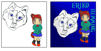 _________________ Child ~ CardCaptor Sakura |
||||||||||||||||||||||||||||||||||||
| Sat Jun 05, 2010 2:22 am |
|
||||||||||||||||||||||||||||||||||||
|
Joined: Sun Sep 28, 2008 6:46 pm Posts: 51 Gender: Anime Girl |
Hey Ray, it's been a long time. It's nice to see you've been spriting, I remember you had that mini movie thing with the custom smilies. Good times, but I digress. It seems you want to have some quality sprites and nice animations to match them. for this post I'm only commenting on this particular one, its very late her and well I'm finally getting sleepy. But before I go I'd like to make some small suggestions that I think would be a great asset to your animation First I'd like to admit I didn't actually realize it was an electric based attack the first time I say it. I thought it was some sort of water/ice shield technique. Sorry, but it doesn't give off much of an electric feel to it (my opinion not fact realize this). The wave inside the aura comes off to thick, I think I get what you are trying to do. The wave comes off as an impact (if your going for shield) or a surge to show it exists. For this sort of thing I recommend looking at this. Some good effect references Particularly the last one of course. the electric shield is wavy and follows the characteristics of an electric energy flow. Long story short make it more wavy I guess =P I hope this is of help, and now g'night. |
||||||||||||||||||||||||||||||||||||
| Sat Jun 05, 2010 3:20 am |
|
||||||||||||||||||||||||||||||||||||
|
Joined: Tue Aug 19, 2008 5:35 pm Posts: 929 Location: siouxfalls |
Looking nice, but I would scrap the current fox sprite and start over, its pretty hideous.
_________________ ....I do cocaine.. |
||||||||||||||||||||||||||||||||||||
| Sat Jun 05, 2010 3:28 am |
|
||||||||||||||||||||||||||||||||||||
| Page 6 of 9 |
[ 133 posts ] | Go to page Previous 1 ... 3, 4, 5, 6, 7, 8, 9 Next |
|
All times are UTC - 5 hours |
Who is online |
Users browsing this forum: No registered users and 1 guest |
| You cannot post new topics in this forum You cannot reply to topics in this forum You cannot edit your posts in this forum You cannot delete your posts in this forum You cannot post attachments in this forum |

