| Author |
Message |
|
Happyfrozenfire
Joined: Mon Nov 24, 2014 6:26 pm Posts: 571 Location: NC Country:  Gender:
 Male
MGN Username: [BANNED]
Currently Playing: SSF2TAS

|
SPRITES YAY First off, this isn't really a sprite but rather a ton of sprites put together in paint.net, but here's a cool wallpaper inspired by a classic: What I did is I went through each character and recolored the devs' wonderful works of art to make them fit in with this simplified style. I chose several sprites for each character, but some weren't good enough or didn't fit in with the final product. Here are all of them:   The trail was made by using the sprites for his individual "puffs" and simplifying them and looking at the length of Misfire (and the proportions of the different "puff" sprites).  This project was started in 9b, when I only had 9b sprites to work with, so I had to make Peach look pretty. I think I did a pretty good job, but in the end, Beta came out and I didn't end up using this sprite. However...  Open up SSF2 and look at Peach's sprites. They're so shaded! It makes it impossible to choose/distinguish one color in particular from the rest. This isn't a bad thing, as Peach's sprites are very pretty. However, it does make it very difficult to simplify in the style that I did. In the end, I ended up taking a few bits from the 9b sprite, a few bits from this sprite, and the semi-corset from Melee and merged it all together to create a pretty recolor for an extra-pretty princess. Bowser was an adventure. When I first recolored him, I made the rims of his horns and spikes red.  I thought that maybe a darker color for the rims would look better, so I chose a darker color.  I thought this was cool, but then I checked the original wallpaper and realized that Simplified Melee Bowser doesn't have rims on his spikes, so I colored them the color of his spikes.  However, I wasn't quite satisfied with this. I decided to ask around on several Discords what people thought in hopes of getting advice. In the end, Red Rims won, so I deviated from the original wallpaper and let Bowser have red rims.  That's actually the first one of these I did. Yup. I asked my good friend 27 if I should make it lighter, and he said "Yes." So I did:  Link was annoying to recolor due to the outlines on his sprites. I had to take guesses and even delete some pixels. This would happen a lot more later, but this was my first time deleting pixels while doing this.  Fortunately, being a recolor, Link was easy enough to update to Beta.   Had to get creative here since SSF2 Zelda is Brunette Zelda, not Blonde Zelda. 9b:  God that looked ugly. Beta to the rescue!   This was my 9b Jigglypuff sprite. Not the best.  The melee wallpaper had Jigglypuff with a small mouth. However, this looked bad.  This looked better, but just for s*** and giggles, I expanded the mouth a bit.  This looked better, so this was yet another deviation from the original wallpaper.  God Captain Falcon looks sexy as hell in this. I'm sorry, I just love the way he turned out.  Shield sprite but with a mouth didn't seem like it'd be as good a choice for the wallpaper as Dash attack endlag, so...   I'M SORRY I MADE FOX LOOK LIKE A PUPPY Oh also I edited his visor away  I also edited the visor away for this   Halfway through the second one, a friend asked me "Why is Pit so pale?" I palleted the different shades of his skin and showed said friend that it looks better pale. Either way, I went with the first one, so I guess it doesn't matter. Ness doesn't have a lying down seductively sprite, so I had to improvise and deviate from the original wallpaper.  I decided to put Telly Vision in Pichu's place here. However, Telly Vision was hard to do because his default sprite is facing right, but I needed him to be facing left.  This was a recolor of his default sprite. This wouldn't do.  This is his default sprite flipped. As you can see, his weird circle thing under his left eye was now under his right eye. This would not do.  I edited the sprite to have the dish be on the left side. This didn't look good, so I moved it left slightly more.  This was much better. Now for Chibi's sprites:    I was satisfied with all of these, so since Skailler/Cookies is the best (and only) Chibi main, I asked him what he thought. He told me he prefered the third one, so that's the one that went into the final product. The 9b sprites were actually kinda cute.   The Beta sprites were far from bad, though.   Ended up going with the 2nd Beta one because duh. You know, I could've asked Corvid what sprite to put since he's the best black mage main... But Forum Bros before Tier Hos; I asked Bedoop.    I asked Star what he thought, and he told me the second one's better, so I used it. "OH GOD WHAT THE f*** "WHY "OH OK SO THAT'S HOW LLOYD'S SWORDS WORK NOW. I SEE. f*** YOU, DEVS." That was my initial reaction to seeing Lloyd's sprites in DAT___.ssf (Not saying the number because Nimbleo wouldn't like it). So, let me explain for anyone who doesn't know how they work: The swords are each 3 sprites: The frame, the filling, and the glowey effect. Lloyd himself doesn't have the swords in his hands in the sprites, they're simply pasted there during an animation. This meant I had to do each sword seperately and put it all together in the end. f*** me. Vorpal Sword:  Flamberge:  Lloyd:  Fortunately, the Vorpal Sword is perpendicular to Lloyd the way he holds it when he walks, so I could just fuse the two sprites.  With Flamberge, I waited until I knew how big I wanted Lloyd to be, and then I pasted it onto the enlarged sprite.    Edited the second one's smile and used it.  I decided to put Goku where Mewtwo is in the original. Who's side b could possibly keep up with Luigi's? Sandbag's, of course!  _________________shh, they forgot to ban meJoin the GarrisonHQ Discord here: https://discord.gg/uDam5vj
|
| Mon Jun 26, 2017 3:18 pm |
|
 |
|
Kirb-Star
Joined: Thu Jul 21, 2011 3:15 pm Posts: 6217 Location: Leafless Canada Country:  Gender:
 Male
Skype: Kirb-Star
Waifu: zero suit wario

|
holy guacamoli this looks so friggin unique man!
I love this style.
|
| Mon Jun 26, 2017 5:42 pm |
|
 |
|
Happyfrozenfire
Joined: Mon Nov 24, 2014 6:26 pm Posts: 571 Location: NC Country:  Gender:
 Male
MGN Username: [BANNED]
Currently Playing: SSF2TAS

|
I wish it was unique. It's inspired by something else tho lol
_________________shh, they forgot to ban meJoin the GarrisonHQ Discord here: https://discord.gg/uDam5vj
|
| Mon Jun 26, 2017 9:25 pm |
|
 |
|
Happyfrozenfire
Joined: Mon Nov 24, 2014 6:26 pm Posts: 571 Location: NC Country:  Gender:
 Male
MGN Username: [BANNED]
Currently Playing: SSF2TAS

|
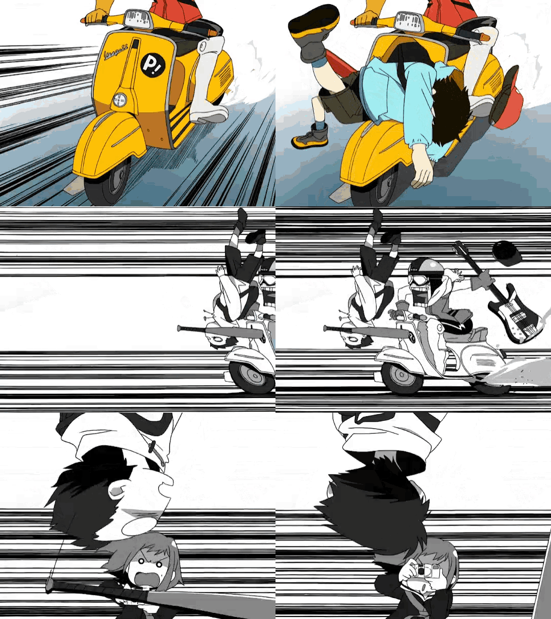
This style is really fun, so I did a new gif for my PFP.  _________________shh, they forgot to ban meJoin the GarrisonHQ Discord here: https://discord.gg/uDam5vj
|
| Fri Jun 30, 2017 9:09 pm |
|
|
Who is online |
Users browsing this forum: No registered users and 1 guest |
|
You cannot post new topics in this forum
You cannot reply to topics in this forum
You cannot edit your posts in this forum
You cannot delete your posts in this forum
You cannot post attachments in this forum
|

|


