| View unanswered posts | View active topics |
It is currently Fri May 15, 2020 8:30 am |
|
All times are UTC - 5 hours |
| Page 13 of 66 |
[ 986 posts ] | Go to page Previous 1 ... 10, 11, 12, 13, 14, 15, 16 ... 66 Next |
Spaghetti Stuff-age: *NEW* JUS Aaron Ehaz sprites.
| Author | Message | |||||||||||||||||||||||||||
|---|---|---|---|---|---|---|---|---|---|---|---|---|---|---|---|---|---|---|---|---|---|---|---|---|---|---|---|---|
|
Joined: Mon Aug 11, 2008 8:51 am Posts: 542 Location: That information is for high-ranked agents of the Pasta Agency. If I told you, I'd have to kill you. Gender: Male |
_________________ Link:  My current project, Aaron Ehaz:  Check out my topic: viewtopic.php?f=11&t=11538 Visit http://forums.nes-productions.com/ |
|||||||||||||||||||||||||||
| Sun Mar 01, 2009 4:41 pm |
|
|||||||||||||||||||||||||||
|
Joined: Mon Aug 11, 2008 7:19 am Posts: 3590 Location: Boston, MA Gender: Male Skype: Chozo |
Looks great! Cna I get a PA? =0
|
|||||||||||||||||||||||||||
| Sun Mar 01, 2009 7:04 pm |
|
|||||||||||||||||||||||||||
|
Joined: Mon Aug 11, 2008 8:51 am Posts: 542 Location: That information is for high-ranked agents of the Pasta Agency. If I told you, I'd have to kill you. Gender: Male |
Sure. What do you want?
Also, progress on a PA Pork n' Beans requested:  Yes, its the deseased Link I made. _________________ Link:  My current project, Aaron Ehaz:  Check out my topic: viewtopic.php?f=11&t=11538 Visit http://forums.nes-productions.com/ |
|||||||||||||||||||||||||||
| Sun Mar 01, 2009 7:47 pm |
|
|||||||||||||||||||||||||||
|
Joined: Mon Aug 11, 2008 7:19 am Posts: 3590 Location: Boston, MA Gender: Male Skype: Chozo |
 Its my ref char. She's supposed to have goggles with red tinted glass butKaze didn't realize he had to sprite them. |
|||||||||||||||||||||||||||
| Sun Mar 01, 2009 8:45 pm |
|
|||||||||||||||||||||||||||
|
Joined: Mon Aug 11, 2008 8:51 am Posts: 542 Location: That information is for high-ranked agents of the Pasta Agency. If I told you, I'd have to kill you. Gender: Male |
Once I'm done with my other PA requests, I'll do yours.
_________________ Link:  My current project, Aaron Ehaz:  Check out my topic: viewtopic.php?f=11&t=11538 Visit http://forums.nes-productions.com/ |
|||||||||||||||||||||||||||
| Sun Mar 01, 2009 8:48 pm |
|
|||||||||||||||||||||||||||
|
Joined: Mon Aug 11, 2008 8:51 am Posts: 542 Location: That information is for high-ranked agents of the Pasta Agency. If I told you, I'd have to kill you. Gender: Male |
_________________ Link:  My current project, Aaron Ehaz:  Check out my topic: viewtopic.php?f=11&t=11538 Visit http://forums.nes-productions.com/ |
|||||||||||||||||||||||||||
| Sun Mar 01, 2009 10:26 pm |
|
|||||||||||||||||||||||||||
|
Joined: Mon Aug 11, 2008 10:43 am Posts: 641 Gender: Male |
Why does most of it blend, but the hair has a dark outline? _________________ Tyler~ |
|||||||||||||||||||||||||||
| Sun Mar 01, 2009 10:40 pm |
|
|||||||||||||||||||||||||||
|
Joined: Mon Aug 11, 2008 8:51 am Posts: 542 Location: That information is for high-ranked agents of the Pasta Agency. If I told you, I'd have to kill you. Gender: Male |
*goes to fix*
_________________ Link:  My current project, Aaron Ehaz:  Check out my topic: viewtopic.php?f=11&t=11538 Visit http://forums.nes-productions.com/ |
|||||||||||||||||||||||||||
| Sun Mar 01, 2009 10:42 pm |
|
|||||||||||||||||||||||||||
|
Joined: Mon Aug 11, 2008 10:23 am Posts: 1305 Location: in front of the computer Gender: Male |
can i get a PA?
_________________    |
|||||||||||||||||||||||||||
| Mon Mar 02, 2009 5:33 pm |
|
|||||||||||||||||||||||||||
|
Joined: Mon Aug 11, 2008 7:19 am Posts: 3590 Location: Boston, MA Gender: Male Skype: Chozo |
|
|||||||||||||||||||||||||||
| Mon Mar 02, 2009 7:03 pm |
|
|||||||||||||||||||||||||||
|
Joined: Mon Aug 11, 2008 10:23 am Posts: 1305 Location: in front of the computer Gender: Male |
lulz, i dont need one if he doesnt want to make it. =P
_________________    |
|||||||||||||||||||||||||||
| Mon Mar 02, 2009 7:07 pm |
|
|||||||||||||||||||||||||||
|
Joined: Mon Aug 11, 2008 6:37 am Posts: 613 Location: I'm not sure. |
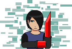
Many crits on this thing. The hair texture looks like some messed-up-crumbled-paper (M.U.C.P. !!! OMG) The shading on the hat is a different style than any other part. It has waay too many shades too. The skin color could change, less orange plz. Shirt texture seems a bit over done don't you think? There needs to be a lot more detail on the collar shirt. Okay, to tell you, not all sprites look good with massive amounts of palletes. Did you see GDKN's D.K.? It only has 3 shades on it's fur texture; yet it looks wonderful. To make things look good, put more contrast within the shading. You need to work on the following for coloring: Less shade palletes, add more detail, don't over do detail and more contrast. Nice big crits see? |
|||||||||||||||||||||||||||
| Mon Mar 02, 2009 7:10 pm |
|
|||||||||||||||||||||||||||
|
Joined: Mon Aug 11, 2008 8:51 am Posts: 542 Location: That information is for high-ranked agents of the Pasta Agency. If I told you, I'd have to kill you. Gender: Male |
THANK YOU!!! A great critic at last. I want people to tell me the problems so I can make the sprite to the best of my ability. That's why I love crits.
_________________ Link:  My current project, Aaron Ehaz:  Check out my topic: viewtopic.php?f=11&t=11538 Visit http://forums.nes-productions.com/ |
|||||||||||||||||||||||||||
| Mon Mar 02, 2009 8:51 pm |
|
|||||||||||||||||||||||||||
|
Joined: Mon Aug 11, 2008 6:37 am Posts: 613 Location: I'm not sure. |
Why thank you. Yes less amounts of shading stages. |
|||||||||||||||||||||||||||
| Mon Mar 02, 2009 9:10 pm |
|
|||||||||||||||||||||||||||
|
Joined: Mon Aug 11, 2008 8:51 am Posts: 542 Location: That information is for high-ranked agents of the Pasta Agency. If I told you, I'd have to kill you. Gender: Male |
Every problem has been fixed but the detail on the collar and I need to shade the hair.
_________________ Link:  My current project, Aaron Ehaz:  Check out my topic: viewtopic.php?f=11&t=11538 Visit http://forums.nes-productions.com/ |
|||||||||||||||||||||||||||
| Mon Mar 02, 2009 11:09 pm |
|
|||||||||||||||||||||||||||
| Page 13 of 66 |
[ 986 posts ] | Go to page Previous 1 ... 10, 11, 12, 13, 14, 15, 16 ... 66 Next |
|
All times are UTC - 5 hours |
Who is online |
Users browsing this forum: No registered users and 1 guest |
| You cannot post new topics in this forum You cannot reply to topics in this forum You cannot edit your posts in this forum You cannot delete your posts in this forum You cannot post attachments in this forum |


