| View unanswered posts | View active topics |
It is currently Thu May 14, 2020 5:36 pm |
|
All times are UTC - 5 hours |
LunarRose's Sprite Place"New Kirby Sprite"
Moderator: Arel
| Page 2 of 3 |
[ 32 posts ] | Go to page Previous 1, 2, 3 Next |
LunarRose's Sprite Place"New Kirby Sprite"
| Author | Message | |||||||||||||||||||||||||||||||||||||||||||||
|---|---|---|---|---|---|---|---|---|---|---|---|---|---|---|---|---|---|---|---|---|---|---|---|---|---|---|---|---|---|---|---|---|---|---|---|---|---|---|---|---|---|---|---|---|---|---|
 Joined: Sun Sep 11, 2011 11:00 am Posts: 13 Location: Charlotte, NC Gender: Male |
I'll reshade him sometime this week and see how it turns out. Thanks. |
|||||||||||||||||||||||||||||||||||||||||||||
| Mon Sep 12, 2011 7:02 pm |
|
|||||||||||||||||||||||||||||||||||||||||||||
|
Joined: Sun Sep 11, 2011 11:00 am Posts: 13 Location: Charlotte, NC Gender: Male |
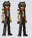
Don't mean to double post but might as well have reshaded him tonight. So here's how it turned out.
|
|||||||||||||||||||||||||||||||||||||||||||||
| Mon Sep 12, 2011 10:07 pm |
|
|||||||||||||||||||||||||||||||||||||||||||||
 Joined: Fri Sep 17, 2010 12:31 am Posts: 2229 Gender: N/A |
Wow you learn fast, thats about 200% better. Fix the lighting in his hair for now, when I get home from school i'll take a closer look at the rest - his hands need to be fixed as well -
_________________  |
|||||||||||||||||||||||||||||||||||||||||||||
| Tue Sep 13, 2011 10:18 am |
|
|||||||||||||||||||||||||||||||||||||||||||||
|
Joined: Sun Sep 11, 2011 11:00 am Posts: 13 Location: Charlotte, NC Gender: Male |
Thanks, I was trying to reshade everything but honestly I didn't think about the hair when I was redoing it. It actually hit me when I uploaded this |
|||||||||||||||||||||||||||||||||||||||||||||
| Tue Sep 13, 2011 2:44 pm |
|
|||||||||||||||||||||||||||||||||||||||||||||
|
Joined: Fri Sep 17, 2010 12:31 am Posts: 2229 Gender: N/A |
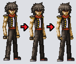
NP, I have settled down and have been home for awhile - so I threw this together for ya. (you will need to save it and zoom in)
 RED Red shows the difference between the flow of the arm, your hand suddenly juts where its unnatural. When you go to punch someone you want your hand to be in a comfortable position and sturdy- that being the most common position - which is flat. If you hold your hand in a fist, try and line your *pointer finger knuckle up with the top of your arm so it almost looks like your forearm doesn't stop - that's what your characters hand should be like. Once again your sig was the perfect example. BLUE Blue shows the difference between proportion in the arm, your characters forearm is extremely long which can look very unnatural. By fixing the hand your characters arm will look much better, but its still not quite natural. If you want you character to be long and lean then disregard this next part and just fix the hand. (sometimes emphasis can be to your advantage) *If you want your character to be shorter but with better proportions - it starts with the pelvis area. If you noticed - the area where the zipper would be on jeans is really long on your character, all you really have to do is shorten that area and its good to go - this should be quite easy because that area is covered by a shadow and will be really easy to fix up. " But wait now his arms are WAY to long!" To fix that all you need to do is shorten his forearms, by doing so it will also fix the arm proportions.* BTW I really like your character so far =] _________________ |
|||||||||||||||||||||||||||||||||||||||||||||
| Tue Sep 13, 2011 6:55 pm |
|
|||||||||||||||||||||||||||||||||||||||||||||
|
Joined: Sun Sep 11, 2011 11:00 am Posts: 13 Location: Charlotte, NC Gender: Male |
The pelvis area/zipper part isn't actually long, his right leg at that angle just overlaps his other leg somewhat. His arm at that angle looks higher because if you stand like that, both arms would not appear the same length. The one farther back would look as if it is shorter hence why I made it like that.
|
|||||||||||||||||||||||||||||||||||||||||||||
| Tue Sep 13, 2011 8:32 pm |
|
|||||||||||||||||||||||||||||||||||||||||||||
|
Joined: Fri Sep 17, 2010 12:31 am Posts: 2229 Gender: N/A |
You're a really fast learner! Yikes!
Either way, the only complaint/suggestion is to make his glove go higher up on his arm. Right now his hands look very small (lengthwise) and it could be solved with making the glove longer. _________________ |
|||||||||||||||||||||||||||||||||||||||||||||
| Tue Sep 13, 2011 8:36 pm |
|
|||||||||||||||||||||||||||||||||||||||||||||
|
Joined: Sun Sep 11, 2011 11:00 am Posts: 13 Location: Charlotte, NC Gender: Male |
I think I'm finally finished
 |
|||||||||||||||||||||||||||||||||||||||||||||
| Wed Sep 14, 2011 10:32 pm |
|
|||||||||||||||||||||||||||||||||||||||||||||
|
Joined: Fri Sep 17, 2010 12:31 am Posts: 2229 Gender: N/A |
Ya i'd say so, it looks good - and it's fantastic that you can devote your time into it, most people just give up if someone finds a problem with it. I think you should try your hand at animating him, unless you want to move onto new characters of course xD _________________ |
|||||||||||||||||||||||||||||||||||||||||||||
| Wed Sep 14, 2011 10:46 pm |
|
|||||||||||||||||||||||||||||||||||||||||||||
|
Joined: Sun Sep 11, 2011 11:00 am Posts: 13 Location: Charlotte, NC Gender: Male |
I'm definitely going to animate him. He's going to be the main character of my game I'm programming.
|
|||||||||||||||||||||||||||||||||||||||||||||
| Wed Sep 14, 2011 11:14 pm |
|
|||||||||||||||||||||||||||||||||||||||||||||
|
Joined: Fri Sep 17, 2010 12:31 am Posts: 2229 Gender: N/A |
Great stuff, and good luck to ya. _________________ |
|||||||||||||||||||||||||||||||||||||||||||||
| Wed Sep 14, 2011 11:34 pm |
|
|||||||||||||||||||||||||||||||||||||||||||||
|
Joined: Sun Sep 11, 2011 11:00 am Posts: 13 Location: Charlotte, NC Gender: Male |
Kirby I threw together quickly.
 |
|||||||||||||||||||||||||||||||||||||||||||||
| Thu Sep 22, 2011 9:18 pm |
|
|||||||||||||||||||||||||||||||||||||||||||||
 Joined: Tue Apr 06, 2010 4:47 am Posts: 2081 Location: At home, working and playing Gender: Male |
The shade on the left foot doesn't match the light source actually and the arm outline is stuck to one of Kirby's cheeks |
|||||||||||||||||||||||||||||||||||||||||||||
| Fri Sep 23, 2011 2:48 am |
|
|||||||||||||||||||||||||||||||||||||||||||||
|
Site Moderator  Joined: Wed Nov 12, 2008 4:13 pm Posts: 7252 Country: ")
Gender: Male Waifu: ElvisDitto |
The mouth being a square looks really bad, and the outline needs some smoothening in some places (on the top of the main 'body'). Other then that it's pretty good, but I feel like you could drop a few uneccesary shades if you want too. _________________    (you can now tweet mean things at me on Twitter @StevenEggplant) |
|||||||||||||||||||||||||||||||||||||||||||||
| Fri Sep 23, 2011 8:26 am |
|
|||||||||||||||||||||||||||||||||||||||||||||
|
Joined: Sun Sep 11, 2011 11:00 am Posts: 13 Location: Charlotte, NC Gender: Male |
Done and done.
I didn't plan on doing that. I started making the mouth but then stopped and started shading him. So then when I finished I completely forgot about the mouth Anyways I think I fixed the problems.
|
|||||||||||||||||||||||||||||||||||||||||||||
| Fri Sep 23, 2011 2:58 pm |
|
|||||||||||||||||||||||||||||||||||||||||||||


| Page 2 of 3 |
[ 32 posts ] | Go to page Previous 1, 2, 3 Next |
|
All times are UTC - 5 hours |
Who is online |
Users browsing this forum: No registered users and 1 guest |
| You cannot post new topics in this forum You cannot reply to topics in this forum You cannot edit your posts in this forum You cannot delete your posts in this forum You cannot post attachments in this forum |