| View unanswered posts | View active topics |
It is currently Thu May 14, 2020 5:36 pm |
|
All times are UTC - 5 hours |
LunarRose's Sprite Place"New Kirby Sprite"
Moderator: Arel
| Page 1 of 3 |
[ 32 posts ] | Go to page 1, 2, 3 Next |
LunarRose's Sprite Place"New Kirby Sprite"
| Author | Message | |||||||||||||||||||||||||||
|---|---|---|---|---|---|---|---|---|---|---|---|---|---|---|---|---|---|---|---|---|---|---|---|---|---|---|---|---|
 Joined: Sun Sep 11, 2011 11:00 am Posts: 13 Location: Charlotte, NC Gender: Male |
I don't have much but that is only for now.
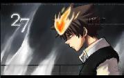
  This is my character Akira for a game I am currently designing. Left is the original one I sprited, right is the new improved one.  Blue falcon Blue falcon Here is a robot design I came up with years ago but never sprited until this summer.  Gonna sprite a few smash bros characters. Last edited by LunarRose on Thu Sep 22, 2011 9:17 pm, edited 1 time in total. |
|||||||||||||||||||||||||||
| Sun Sep 11, 2011 11:48 am |
|
|||||||||||||||||||||||||||
 Joined: Tue Sep 06, 2011 5:04 pm Posts: 18 Gender: Anime Girl |
Blue Falcon it's nicee
|
|||||||||||||||||||||||||||
| Sun Sep 11, 2011 12:45 pm |
|
|||||||||||||||||||||||||||
|
Joined: Mon Apr 04, 2011 6:20 pm Posts: 104 Location: F!@#......behind that tree over there Gender: Male Currently Playing: Ultimate Marvel vs Capcom 3 |
Wow these are really good if these are from scratch IMO,the first characters hands could be better and some parts are kinda pillowed buts that's really all i can say.
_________________ What is this I don`t even- Last edited by reborn574 on Sun Sep 11, 2011 2:06 pm, edited 1 time in total. |
|||||||||||||||||||||||||||
| Sun Sep 11, 2011 12:46 pm |
|
|||||||||||||||||||||||||||
 Joined: Fri Sep 17, 2010 12:31 am Posts: 2229 Gender: N/A |
Akira,
tsk tsk tsk... You almost got away with it... Sorry but he has no defined light source, and is most definitely pillow shaded. You should decide on a light source and try and reshade him. _________________  |
|||||||||||||||||||||||||||
| Sun Sep 11, 2011 1:41 pm |
|
|||||||||||||||||||||||||||
 Joined: Mon Aug 11, 2008 10:23 am Posts: 1305 Location: in front of the computer Gender: Male |
The first ones head looks really good, but the body is lacking. Skin has too much contrast in the lightest shade, and the anatomy looks off to me. The blue falcon has decent line art but you should never shade with gradients, they generally look bad.
The robot looks great on the lighter areas, but too dull in shaded areas. Just because the light isn't directly on him doesn't make his luster disappear, but you make it seem that way. Work on the color choice in darker areas. _________________  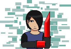 |
|||||||||||||||||||||||||||
| Sun Sep 11, 2011 4:46 pm |
|
|||||||||||||||||||||||||||
|
Joined: Sun Sep 11, 2011 11:00 am Posts: 13 Location: Charlotte, NC Gender: Male |
For Akira, I have the light source from the left hence why the left side of the sprite has generally lighter shade than the right. The colors are just close to the same shades making it look pillowed.
|
|||||||||||||||||||||||||||
| Sun Sep 11, 2011 7:27 pm |
|
|||||||||||||||||||||||||||
 Joined: Tue Apr 06, 2010 4:47 am Posts: 2081 Location: At home, working and playing Gender: Male |
Blue Falcon is poorly gradient shaded
|
|||||||||||||||||||||||||||
| Sun Sep 11, 2011 9:33 pm |
|
|||||||||||||||||||||||||||
|
Joined: Fri Sep 17, 2010 12:31 am Posts: 2229 Gender: N/A |
Its pillow shaded... your lightest colours all start from the center of your shapes and reseed outwards - simple as that. _________________ |
|||||||||||||||||||||||||||
| Sun Sep 11, 2011 10:18 pm |
|
|||||||||||||||||||||||||||
|
Joined: Sun Sep 11, 2011 11:00 am Posts: 13 Location: Charlotte, NC Gender: Male |
It doesn't really matter...
|
|||||||||||||||||||||||||||
| Sun Sep 11, 2011 10:22 pm |
|
|||||||||||||||||||||||||||
|
Joined: Mon Aug 11, 2008 10:23 am Posts: 1305 Location: in front of the computer Gender: Male |
Yes... It does... Never pillow shade...
_________________ |
|||||||||||||||||||||||||||
| Mon Sep 12, 2011 1:05 am |
|
|||||||||||||||||||||||||||
|
Joined: Fri Sep 17, 2010 12:31 am Posts: 2229 Gender: N/A |
Sorry man... but if you wan't to have a sprite topic - you can't just use it to showcase your stuff and not expect criticism. I'm not speaking for everyone else - but one of the things I hate the most is people who ask for help then don't take it. (or people who just can't accept the facts) If you check out Google just look up a couple shading tutorials, they are absolutely everywhere - and in the end you won't regret learning a thing or two. - HERE - I was even nice enough to give you a nice little tutorial about basic spriting, you have most of this stuff down - its just the lighting. http://spriters-resource.com/community/ ... ?tid=13868 _________________ |
|||||||||||||||||||||||||||
| Mon Sep 12, 2011 1:09 am |
|
|||||||||||||||||||||||||||
 Joined: Sat Aug 23, 2008 3:10 am Posts: 2601 Location: Australia - Sydney Gender: Male Currently Playing: Ninja Gaiden III |
You have to remember that the intensity is inversely proportional to the distance (squared). That means that you need more circular changes in gradient. Given that the sides are flat, it'd be better to just reduce the number of comparable light position thingies. Also, listen to what was said about pillow shading. If you don't listen, you'll improve a lot more slowly. _________________  |
|||||||||||||||||||||||||||
| Mon Sep 12, 2011 2:02 am |
|
|||||||||||||||||||||||||||
|
SSF2 Developer  Joined: Thu Sep 02, 2010 2:13 pm Posts: 726 Location: Minnesota Country: ")
Gender: Male Skype: LegitPixelBoy Currently Playing: Super Smash Flash 2 |
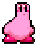
He never pillow shaded guys... Look.
Pillow Shading: Light colors surounded by dark colors on all sides.  Gradient Shading: Shift from light to Dark or Dark to Light.  These examples were not made by me. |
|||||||||||||||||||||||||||
| Mon Sep 12, 2011 7:19 am |
|
|||||||||||||||||||||||||||
|
Joined: Sun Sep 11, 2011 11:00 am Posts: 13 Location: Charlotte, NC Gender: Male |
I do take criticism and I know basic shading but people always tell me about pillow shading in which I for the most part try to avoid but there can be one part that is pillow shaded, and even if it look's alright for that sprite, people generally say something negative about it. I'm not saying your being negative, your actually trying to help unlike a lot of other people who just say something pointless like "OMGZ liek super epic failz lol". All in all i try not to pillow shade but for specific parts of the body it looks better to me pillowed slightly, and if I try to shade it another way, it tends to look awkward. |
|||||||||||||||||||||||||||
| Mon Sep 12, 2011 2:19 pm |
|
|||||||||||||||||||||||||||
|
Joined: Fri Sep 17, 2010 12:31 am Posts: 2229 Gender: N/A |
K well if your having troubles with getting the shading right... theres a perfect example/reference right under your nose. On the right arm of Akira is where the pillow shading is really bad, so look at Ryu from Ninja Gaiden in your sig - his arm has a very clear light souce. Although your shadows don't need to be as dark try and get your characters shadows to look almost as natural as they do on Ryu. _________________ |
|||||||||||||||||||||||||||
| Mon Sep 12, 2011 3:34 pm |
|
|||||||||||||||||||||||||||

| Page 1 of 3 |
[ 32 posts ] | Go to page 1, 2, 3 Next |
|
All times are UTC - 5 hours |
Who is online |
Users browsing this forum: No registered users and 1 guest |
| You cannot post new topics in this forum You cannot reply to topics in this forum You cannot edit your posts in this forum You cannot delete your posts in this forum You cannot post attachments in this forum |