| View unanswered posts | View active topics |
It is currently Thu May 14, 2020 5:27 pm |
|
All times are UTC - 5 hours |
| Page 2 of 5 |
[ 71 posts ] | Go to page Previous 1, 2, 3, 4, 5 Next |
Panthera leo is back from the temporarily unconsious
| Author | Message | ||||||||||||||||||
|---|---|---|---|---|---|---|---|---|---|---|---|---|---|---|---|---|---|---|---|
 Joined: Fri Jan 22, 2010 8:39 pm Posts: 563 Location: Florida Country: ")
Gender: Male MGN Username: masterp443 Skype: masuta_marusu Currently Playing: v0.9b |
If you're talking about the R/B/Y/(G) revamps, then I followed the pattern left by the old-school games, while using colors from Gen III and beyond. I never wanted to change their color arrangements, just the color palette. ---- Pichu: |
||||||||||||||||||
| Tue Jul 19, 2011 12:30 pm |
|
||||||||||||||||||
|
Joined: Fri Jan 22, 2010 8:39 pm Posts: 563 Location: Florida Country:
Gender: Male MGN Username: masterp443 Skype: masuta_marusu Currently Playing: v0.9b |
New stage WIP, untitled but will have a title soon!
http://img8.imageshack.us/img8/8294/unledstage.png http://img30.imageshack.us/img30/8294/unledstage.png http://img600.imageshack.us/img600/8294/unledstage.png  |
||||||||||||||||||
| Thu Jul 28, 2011 5:50 pm |
|
||||||||||||||||||
|
Joined: Fri Jan 22, 2010 8:39 pm Posts: 563 Location: Florida Country:
Gender: Male MGN Username: masterp443 Skype: masuta_marusu Currently Playing: v0.9b |
 The RMS Queen Smash! I'm currently fixing the perspective issues, so don't fret! Colors aren't final. |
||||||||||||||||||
| Sun Sep 04, 2011 7:18 pm |
|
||||||||||||||||||
|
Joined: Sun Sep 19, 2010 7:41 pm Posts: 261 Location: Indiana, USA Gender: Male Currently Playing: Fable III |
The tube thing in the middle doesn't look quite right. Can't put my finger on it...
|
||||||||||||||||||
| Sun Sep 04, 2011 7:47 pm |
|
||||||||||||||||||
|
Joined: Fri Jan 22, 2010 8:39 pm Posts: 563 Location: Florida Country:
Gender: Male MGN Username: masterp443 Skype: masuta_marusu Currently Playing: v0.9b |
The "tube thing" is a smoke stack/ship chimney/exhaust pipe. It's in the background, and I don't think it's to perspective yet. |
||||||||||||||||||
| Sun Sep 04, 2011 7:53 pm |
|
||||||||||||||||||
|
Joined: Sun Sep 19, 2010 7:41 pm Posts: 261 Location: Indiana, USA Gender: Male Currently Playing: Fable III |
It doesn't follow the laws of physics. The picture makes it look like there's only a tiny bit of deck beyond the metal platform, yet the smoke-stack is thicker then that amount. It would fall off.
|
||||||||||||||||||
| Mon Sep 05, 2011 10:03 am |
|
||||||||||||||||||
|
Joined: Fri Jan 22, 2010 8:39 pm Posts: 563 Location: Florida Country:
Gender: Male MGN Username: masterp443 Skype: masuta_marusu Currently Playing: v0.9b |
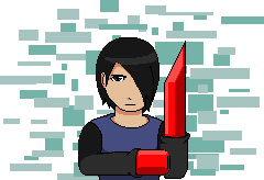
Makes sense. I'll be updating it soon. --- Meanwhile in character sprite land, I present to you, Link!  I plan on making an expansion of some sort out of this. Any critique would be much appreciated. |
||||||||||||||||||
| Mon Sep 05, 2011 11:47 am |
|
||||||||||||||||||
|
Site Moderator  Joined: Wed Nov 12, 2008 4:13 pm Posts: 7252 Country: ")
Gender: Male Waifu: ElvisDitto |
Colour pallet is good, could've used a darker darkest shade though IMO. Outlining and lineart definetily need improvement, lines need to look less wobbly and some parts need new outlines (looking at the boots for example) Details are overall lacking, Shield is barely the Hylian shield in shape or colouring, Master Sword looks like Meta Knight's Sword in KSSU, his hat is rather short, belt looks like it cuts his organs inside in two and the way the knees bend is slightly akward. Detailing is rather difficult tho. Clothing could also use the V-neck and some folds IMO. Try to pay more attention to shapes and details, colouring looks decent. _________________    (you can now tweet mean things at me on Twitter @StevenEggplant) |
||||||||||||||||||
| Mon Sep 05, 2011 1:16 pm |
|
||||||||||||||||||
|
Joined: Fri Jan 22, 2010 8:39 pm Posts: 563 Location: Florida Country:
Gender: Male MGN Username: masterp443 Skype: masuta_marusu Currently Playing: v0.9b |
I did use a N64 game as a reference, so detail probably could use some improvement. :p
 I do appreciate your help, though. Thanks Damian. |
||||||||||||||||||
| Mon Sep 05, 2011 1:33 pm |
|
||||||||||||||||||
|
Joined: Fri Jan 22, 2010 8:39 pm Posts: 563 Location: Florida Country:
Gender: Male MGN Username: masterp443 Skype: masuta_marusu Currently Playing: v0.9b |
UPDATE:
Fixed up Link! NOTE: I forgot to color in the sheath, so ignore that.  |
||||||||||||||||||
| Mon Sep 05, 2011 9:03 pm |
|
||||||||||||||||||
 Joined: Mon Aug 11, 2008 10:23 am Posts: 1305 Location: in front of the computer Gender: Male |
You keep making his legs look feminine. First it looked like he had heels, and then that... Link has the triforce of courage, MAKE HIM LOOK COURAGOUS. Right now he looks like a cheap hooker, IMO... Mainly the legs are a problem, but I'd suggest starting over with a newer reference... How is he supposed to fight standing like that? You definitely need to fix that pose.
_________________   |
||||||||||||||||||
| Mon Sep 05, 2011 11:24 pm |
|
||||||||||||||||||
 Joined: Thu Jul 07, 2011 10:48 pm Posts: 191 Location: Canadaland Gender: Male Currently Playing: Skyrim |
I found the pose to be far superior in the first image.
The limbs seem to be incredibly disproportionate although you've almost nailed the basic outline. |
||||||||||||||||||
| Tue Sep 06, 2011 12:12 am |
|
||||||||||||||||||
|
Joined: Fri Jan 22, 2010 8:39 pm Posts: 563 Location: Florida Country:
Gender: Male MGN Username: masterp443 Skype: masuta_marusu Currently Playing: v0.9b |
Thanks. Will fix, though I liked the second one's pose better. Ah well, I can see some general flaws on it, so I'm not too worried about that. Thanks for the critique.
So the checklist looks like: -Fix legs Any more problems before I fix anything else? |
||||||||||||||||||
| Tue Sep 06, 2011 4:49 am |
|
||||||||||||||||||
|
Joined: Mon Aug 11, 2008 10:23 am Posts: 1305 Location: in front of the computer Gender: Male |
I honestly think that you'd do better just starting over. It doesn't look that bad, but it definitely could be better, and a lot of the times it's much easier to start over than just fix every miniscule error, because right now there are some problems legs, yes, but there are also problems with arm shape, shading work in general(though I do agree with Damian, the colors aren't bad), the shape of the sword and shield(polygonal is not good, I'd suggest using a newer reference), the hat's lineart needs work, too many lines look straight. Then the face is off, the hair looks too high and too far forward, I suggest using a pose with a 3/4 view instead of a straight sideways view. You have a 3/4 view with the body, but the head is straight forward, and that complicates things.
_________________ |
||||||||||||||||||
| Tue Sep 06, 2011 5:42 pm |
|
||||||||||||||||||
|
BR Member  Joined: Wed Dec 22, 2010 10:38 pm Posts: 425 Gender: Male Currently Playing: Chaconne |
I think the main main problem with your sprite is that you're drawing with pixels.
Don't worry, loads of begginers do it, but it's actually quite different from spriting. The difference is hard to explain, but basically it's that you're not using the medium to it's full potential. Try making something smaller. This will help for a number of reasons. 1: It's easier to make smaller sprites period. 2: Detail is easier to incorporate. 3: Smaller sprites are easier to animate. 4: It's too big to be an expansion as it stands. _________________  |
||||||||||||||||||
| Fri Sep 09, 2011 4:16 pm |
|
||||||||||||||||||
| Page 2 of 5 |
[ 71 posts ] | Go to page Previous 1, 2, 3, 4, 5 Next |
|
All times are UTC - 5 hours |
Who is online |
Users browsing this forum: No registered users and 1 guest |
| You cannot post new topics in this forum You cannot reply to topics in this forum You cannot edit your posts in this forum You cannot delete your posts in this forum You cannot post attachments in this forum |